A fresh coat of paint can completely change the personality of a kitchen without requiring a major renovation. I love how the right color can make cabinets feel newer, brighten dark corners, or create a warmer atmosphere around the dining area. Kitchen paint ideas can also help define different zones and make a small room feel more open.
You do not always need expensive materials or complicated upgrades to create a beautiful result. Sometimes, a carefully chosen shade is enough to make the entire space feel different. Here are some kitchen paint ideas I would consider for a stylish, welcoming, and updated home.
1. Soft White Kitchen Paint
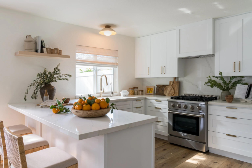
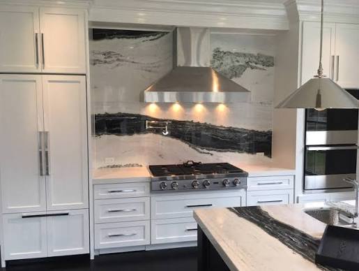
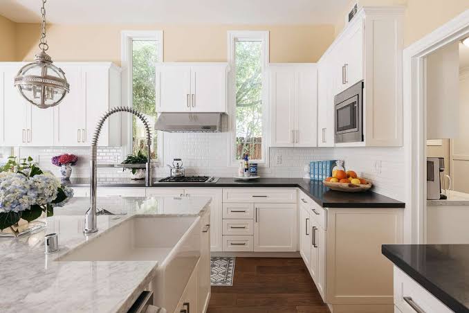
Soft white is one of my favorite kitchen paint choices because it creates a clean and relaxed appearance without feeling too cold. Unlike stark white, softer shades can bring warmth and make the room feel comfortable. I especially like this color in kitchens with limited natural light because it helps reflect available light around the space. Soft white works beautifully with wooden floors, marble countertops, brass hardware, and natural textiles. If your kitchen already has several decorative elements, a soft white background can also keep everything looking balanced instead of visually crowded.
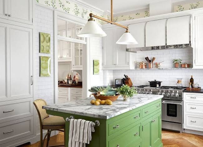
2. Sage Green Kitchen Paint
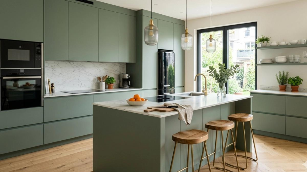
Sage green has become a popular choice for kitchens because it adds color while remaining easy to live with. I like how this muted green creates a connection with nature and gives cabinets or walls a calm appearance. It works particularly well with light wood, cream countertops, white tiles, and brushed brass hardware.
A soft sage shade can make a traditional kitchen feel refreshed without making it look overly trendy. You can use it across the cabinets for a stronger transformation or paint just one wall if you prefer a more subtle change.
3. Warm Beige Kitchen Paint
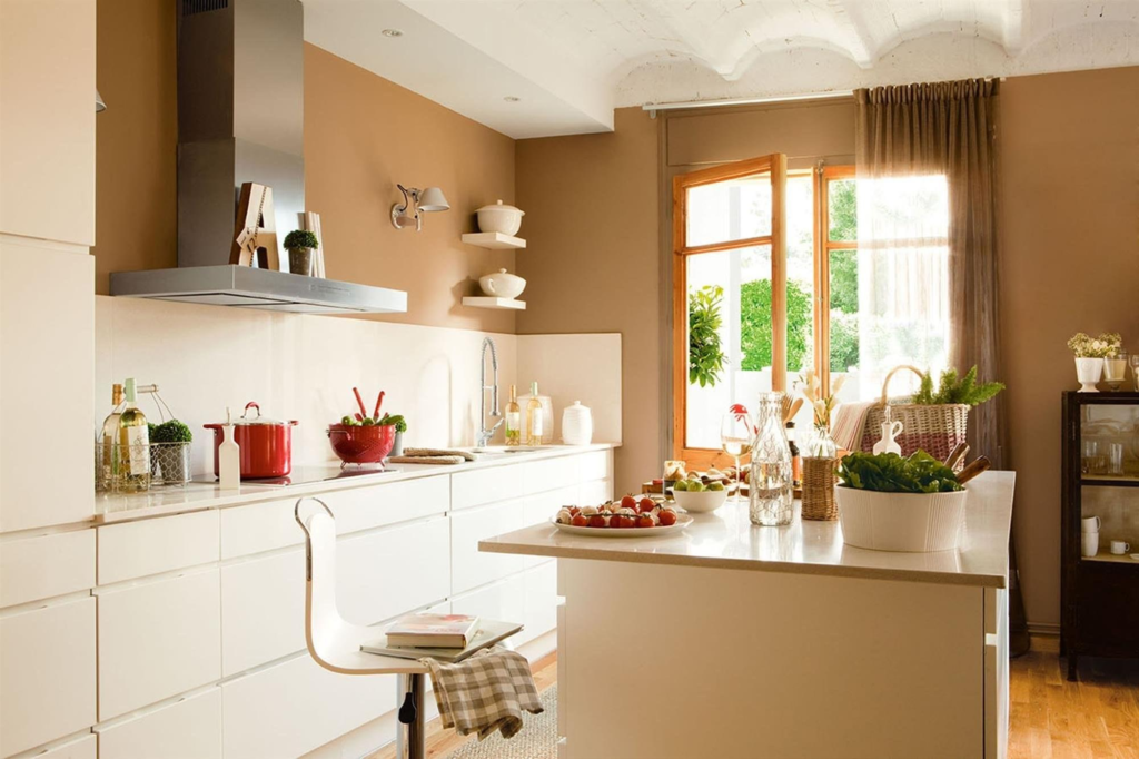
Warm beige is an excellent option when you want your kitchen to feel cozy, inviting, and timeless. I would choose this shade for a space that already has wood finishes because the warm undertones can complement natural materials beautifully.
Beige walls can also soften the appearance of white cabinetry and create a comfortable backdrop for artwork, open shelving, or decorative accessories. Pairing beige with cream, tan, terracotta, or natural wood can create a layered look without needing many colors. It is especially appealing if you want a kitchen that feels relaxed rather than extremely modern.
4. Navy Blue Kitchen Paint

Navy blue can make a kitchen look dramatic and sophisticated while still feeling classic. I particularly like navy on lower cabinets or a kitchen island because it creates a strong visual anchor without making the entire room feel dark.
White countertops, light backsplashes, and warm metallic hardware can balance the deeper color beautifully. If your kitchen has plenty of natural light, navy can create an elegant atmosphere. For smaller kitchens, I would consider using it on one feature area instead of covering every cabinet, especially if you want to keep the room feeling spacious.
5. Terracotta Kitchen Paint

Terracotta is a warm and earthy paint choice that can give a kitchen plenty of personality. I love this shade with natural wood, woven baskets, ceramic accessories, and creamy countertops. It creates a welcoming feeling and works especially well in kitchens inspired by Mediterranean, rustic, or bohemian interiors. You do not need to use terracotta across the entire kitchen to enjoy its effect.
A single accent wall or breakfast nook can introduce enough color to change the atmosphere. If you enjoy warm interiors with an earthy character, this is a paint color worth considering.
6. Light Blue Kitchen Paint

Light blue can make a kitchen feel fresh, airy, and peaceful. I find this color especially attractive in kitchens with white countertops, light flooring, and plenty of daylight. Pale blue cabinets can add personality without overpowering the room, while blue walls can create a soft background for artwork and open shelving. This shade also pairs nicely with silver, chrome, brass, and natural wood finishes.
If you want to introduce color but prefer something gentle, light blue is an easy option. It can give an older kitchen a refreshed appearance without requiring a complete design change.
7. Charcoal Gray Kitchen Paint
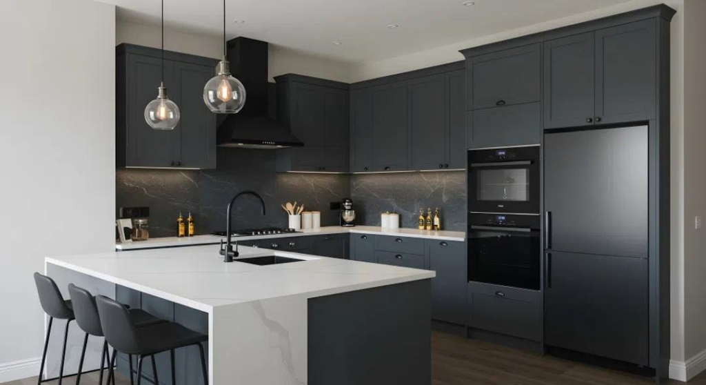
Charcoal gray creates a bold appearance while offering a softer alternative to black. I like using this color on cabinetry because it gives the kitchen a grounded and sophisticated look. Charcoal works especially well with white countertops, warm wood, stainless steel appliances, and simple lighting. If the entire kitchen feels too dark, consider using this paint only on the island or lower cabinets. A lighter wall color can keep the upper portion of the room bright.
This combination creates contrast and makes the cabinetry feel like a deliberate design feature rather than simply another functional element.
8. Cream Kitchen Paint

Cream paint can make a kitchen feel warm, soft, and timeless. I would choose cream when bright white feels too stark but I still want the room to look light. This color pairs beautifully with natural wood, stone, woven textures, antique-style hardware, and warm lighting.
Cream is also useful in traditional and farmhouse kitchens because it creates a comfortable background for decorative details. You can use it on the walls while keeping cabinets white, or create a monochromatic look with slightly different cream tones. The result can feel elegant without looking overly formal.
9. Olive Green Kitchen Paint
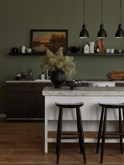
Olive green brings a deeper, earthy quality to the kitchen and can create a very stylish atmosphere. I especially like this color paired with warm wooden shelves, cream walls, natural stone, and aged brass. Unlike brighter greens, olive has a muted quality that makes it easier to incorporate into an everyday kitchen. It can look beautiful across cabinetry or work as an accent color on a feature wall.
If you have an open-plan home, olive green can also help give the kitchen its own identity while still working with neutral living room colors.
10. Black Kitchen Paint
Black paint can create an instantly dramatic kitchen, especially when used strategically. I would avoid thinking of black as something that has to cover every surface. A black island, pantry wall, or lower cabinet section can provide enough contrast to transform the room. Pairing black with white countertops, warm wood, cream walls, or brass hardware keeps the design balanced.
Matte black can create a contemporary appearance, while black combined with traditional hardware can feel more classic. If your kitchen receives plenty of natural light, black cabinetry can become a striking focal point.
11. Dusty Pink Kitchen Paint

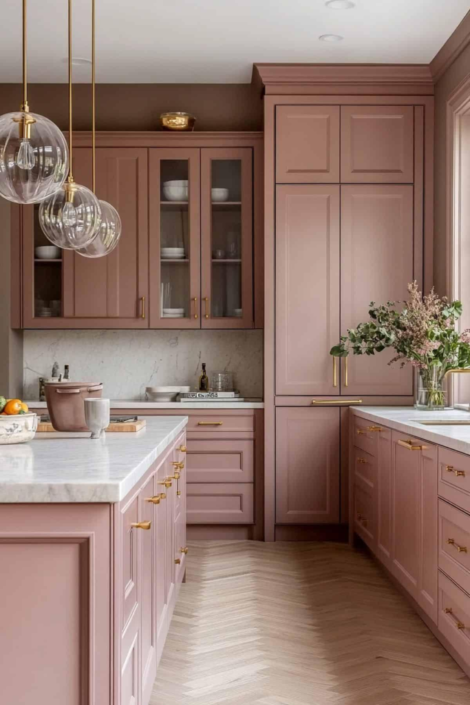
Dusty pink is a creative option for anyone who wants something different without choosing an extremely bright color. I like muted pink because it can feel surprisingly sophisticated when paired with neutral materials. Cream countertops, light oak, marble, brass, and soft gray can all work beautifully with this shade. It can be used on cabinets, an accent wall, or a small breakfast corner.
The muted quality keeps the kitchen feeling mature and stylish. If your space already has neutral finishes, dusty pink can introduce just enough personality to make the room more memorable.
12. Greige Kitchen Paint

Greige combines gray and beige to create a flexible neutral that works with many kitchen styles. I like it because it provides more warmth than traditional gray while offering more depth than plain beige. Greige walls can work beautifully with white cabinets, wood flooring, stone countertops, and black fixtures. It is also a useful choice when you want the kitchen to feel updated without committing to a strong color.
Different lighting conditions can make greige appear warmer or cooler throughout the day, giving the room subtle visual variation.
13. Mustard Yellow Kitchen Paint
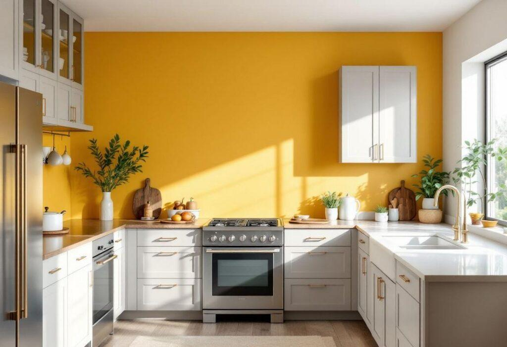
Mustard yellow can bring warmth and energy into a kitchen, making it feel cheerful without looking overly bright. I would use this color as an accent if the rest of the kitchen has neutral finishes. A mustard island, breakfast nook, or feature wall can create an interesting focal point.
It works especially well with white, navy, dark green, natural wood, and warm metallic accents. This shade can also suit vintage-inspired kitchens because of its slightly earthy appearance. If you enjoy playful interiors and want your kitchen to have more personality, mustard yellow is worth exploring.
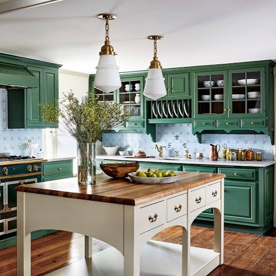
14. Forest Green Kitchen Paint

Forest green creates a rich and elegant look that can make kitchen cabinetry feel luxurious. I love this color paired with warm wood, marble, cream, and brass because these materials soften its deeper appearance. Forest green can work particularly well on an island, lower cabinets, or a full wall of cabinetry. If your kitchen has good natural light, the darker shade can create beautiful depth without making the room feel gloomy.
For a balanced design, I would keep surrounding walls and countertops lighter so the green becomes the main visual feature.
15. Pale Gray Kitchen Paint
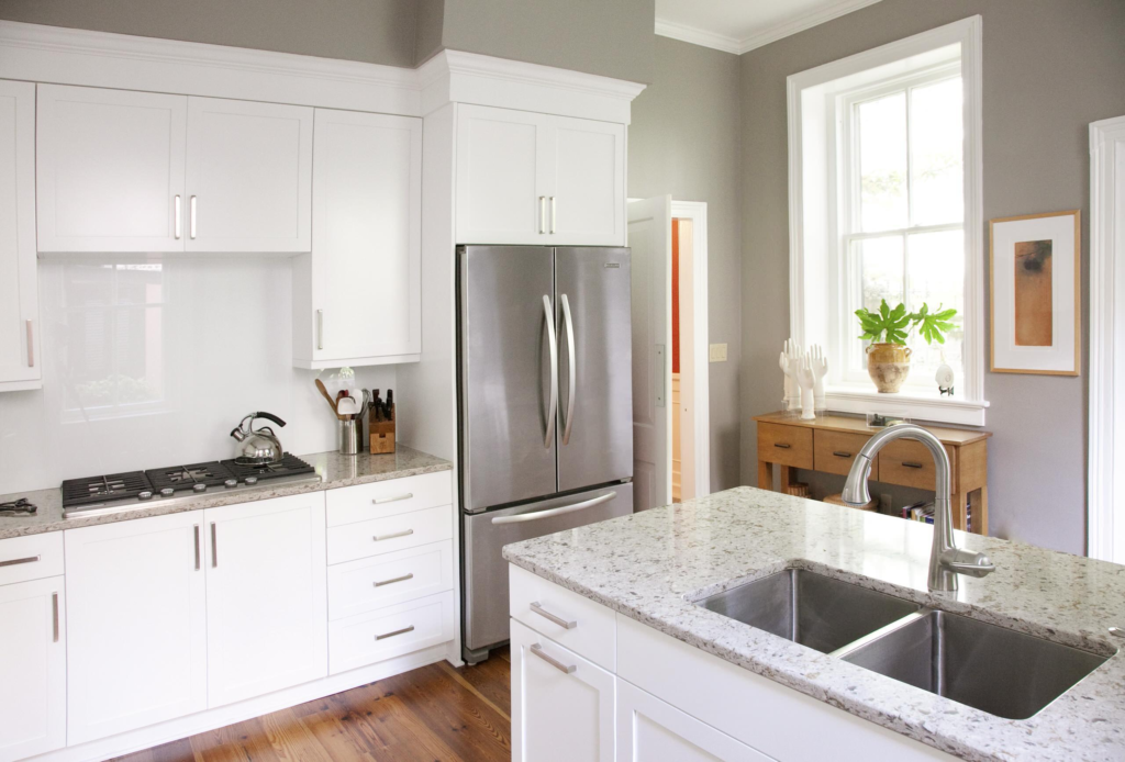
Pale gray is a simple choice for creating a clean and contemporary kitchen. I like how this color adds a little contrast while still maintaining a bright overall appearance. It works nicely with white cabinetry, stainless steel appliances, black fixtures, and natural wood. Pale gray can also help connect different finishes in an open-plan kitchen because it does not compete heavily with surrounding colors.
If you want something more interesting than white but are not ready for a bold shade, this is an easy starting point that can remain stylish for years.
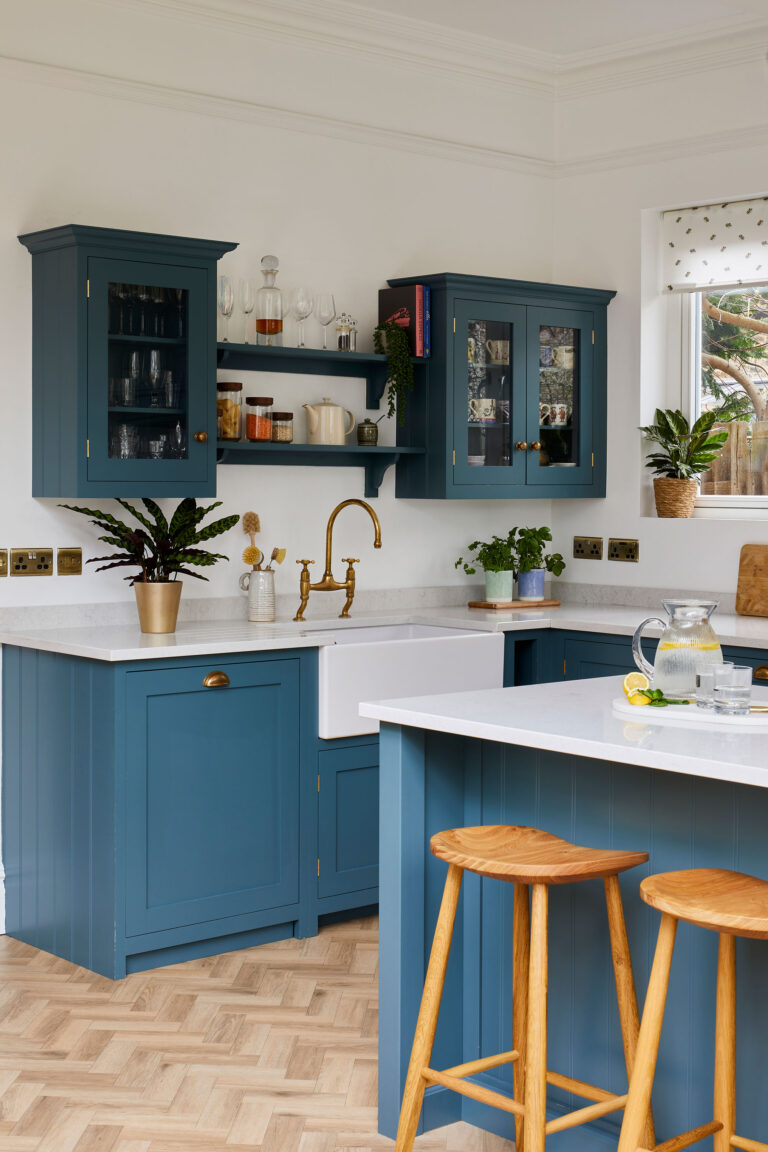
16. Deep Teal Kitchen Paint
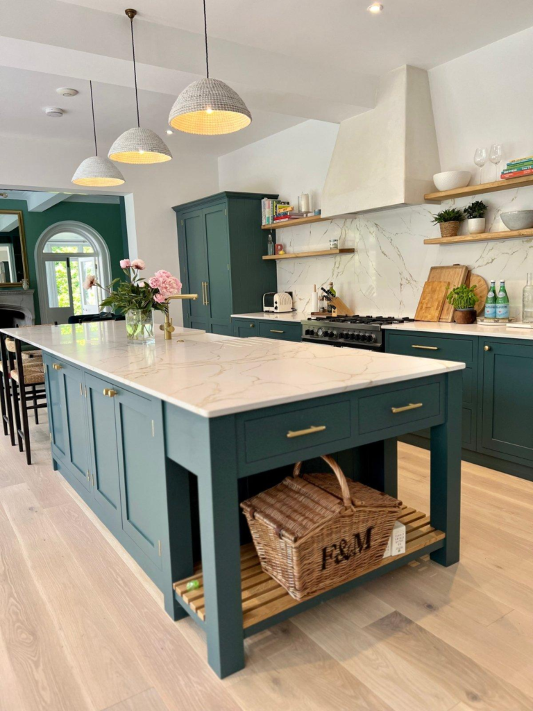
Deep teal combines blue and green to create a rich color that immediately draws attention. I think it works particularly well when used on a kitchen island or lower cabinetry. The color looks beautiful with white marble, cream surfaces, warm wood, and brass hardware.
Deep teal can give a plain kitchen a more customized appearance without requiring structural changes. Since it is a stronger shade, I would balance it with lighter walls and simple accessories. This approach lets the cabinetry provide visual interest while keeping the overall kitchen comfortable and practical.
17. Warm Taupe Kitchen Paint

Warm taupe is a beautiful neutral for kitchens that need more depth without introducing a strong color. I like how it creates a cozy backdrop for wood, stone, cream, and black details. Taupe can work particularly well in kitchens with traditional cabinetry because it adds warmth without making the design feel dated. It also suits modern spaces when paired with clean-lined cabinets and simple hardware.
If you are decorating an open-plan kitchen, taupe can help create a smooth transition between the kitchen, dining area, and living room.
18. Two-Tone Kitchen Paint

A two-tone paint scheme can create a much bigger visual difference than using one color alone. I like pairing a darker shade on the lower cabinets with a lighter shade above because it adds depth while keeping the upper portion bright. Popular combinations include navy and white, sage and cream, green and natural wood, or charcoal and pale gray.
You can also make the island a different color to create a central focal point. This approach gives you more room for creativity while allowing the kitchen to feel coordinated rather than overly colorful.
19. Accent Wall Kitchen Paint
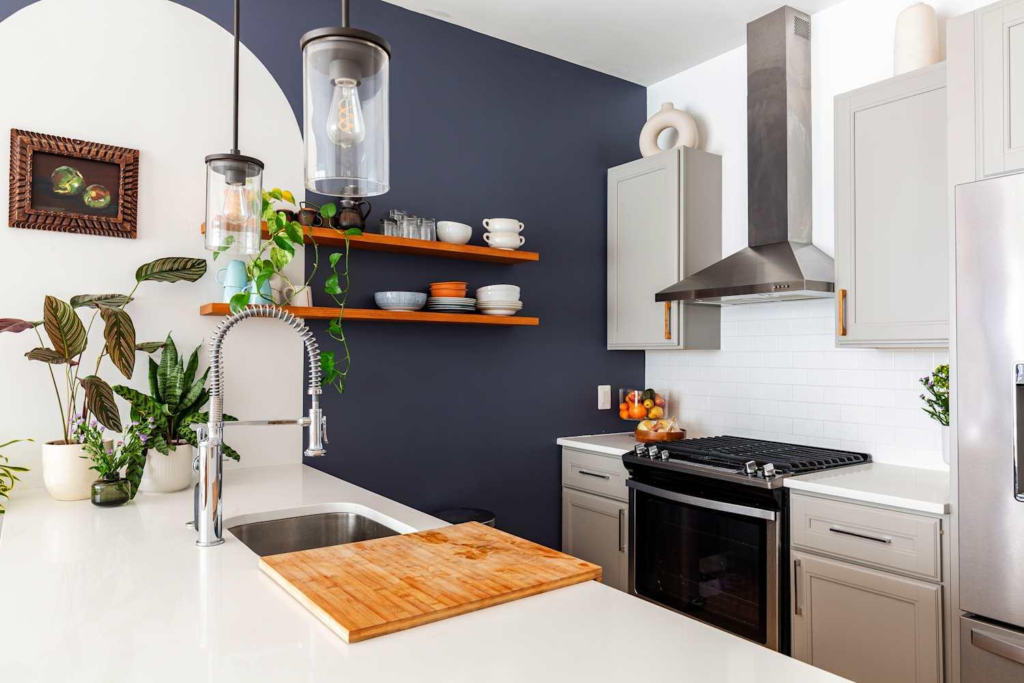
An accent wall is one of the easiest ways I would recommend adding personality to a kitchen without repainting everything. You can choose a bold shade such as deep green, navy, terracotta, or even charcoal and apply it to one carefully selected wall.
The wall behind a dining table, open shelving, or breakfast area can be an excellent location. Keeping the remaining walls neutral helps the accent color stand out. This idea is also useful for renters or homeowners who want a noticeable change while keeping the project relatively simple and affordable.
The right kitchen paint color can make an impressive difference without requiring a complete renovation. I have found that even small changes, such as painting an island, adding an accent wall, or choosing a warmer neutral, can change how the entire room feels. Light shades can make a kitchen appear brighter, while deeper colors can add character and contrast.
The best choice should also work with your cabinets, countertops, flooring, lighting, and personal style. Take time to test a few samples before making your final decision. A thoughtful color choice can give your kitchen a fresh look that feels beautiful, comfortable, and personal.